Grafik psychológom?
Yes, the basic part of the company should be a professionally prepared Corporate Design Manual, in which the company logo, typeface, graphic motifs, patterns, company colors are defined.
But as we wrote in the last post, the unconditional use of only these visual signs can be harmful. It is enough to use the logo in a symbolic size and to follow the basic graphic principles. The customer will find you in properly processed graphics.
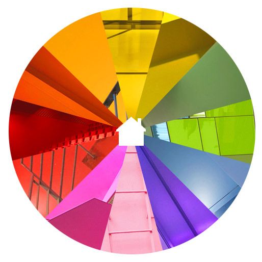
After that, it is up to you and your graphic imagination, how you will deal with the visual further. Colors also affect people. How?
| Colour | Association |
| Red | Active, cheerful, ruling, exciting, stimulating. Loud, strong. Sweet. |
| Orange | Hearty, bright, lively, friendly, bright, cheerful, exciting. Warm, close. |
| Yellow | Hearty, bright, lively, friendly, bright, cheerful, exciting. Warm, close. |
| Green | Soothing, refreshing, calm, peaceful, the color of hope. Young, cold, wet. |
| Blue | Passive, restrained, sure, calm, calm. Cold, wet, shiny, quiet. |
| Purple | Vážna, nešťastná, ponurá. Mystická. |
A graphic designer should be a good psychologist. Some color combinations have a negative effect. So, for example, in the case of lemon-flavored fruit syrup, the use of a combination of yellow and green colors could evoke feelings of acidity or bitterness. On the contrary, the use of a combination of white and blue is common in washing powders – have you noticed? They emphasize lightness, cleanliness.
Want help creating your marketing strategy and plan? Our media strategists are at your disposal!